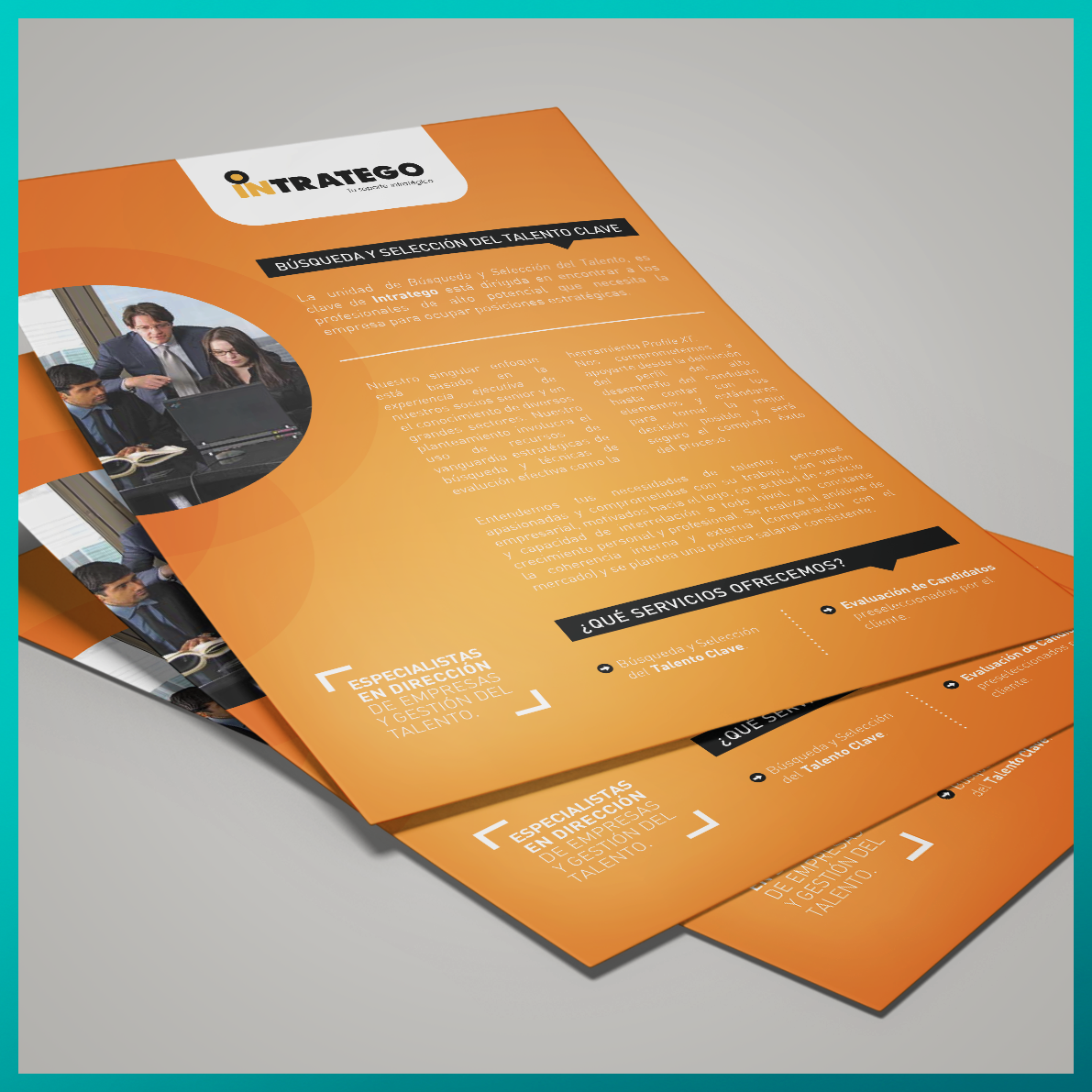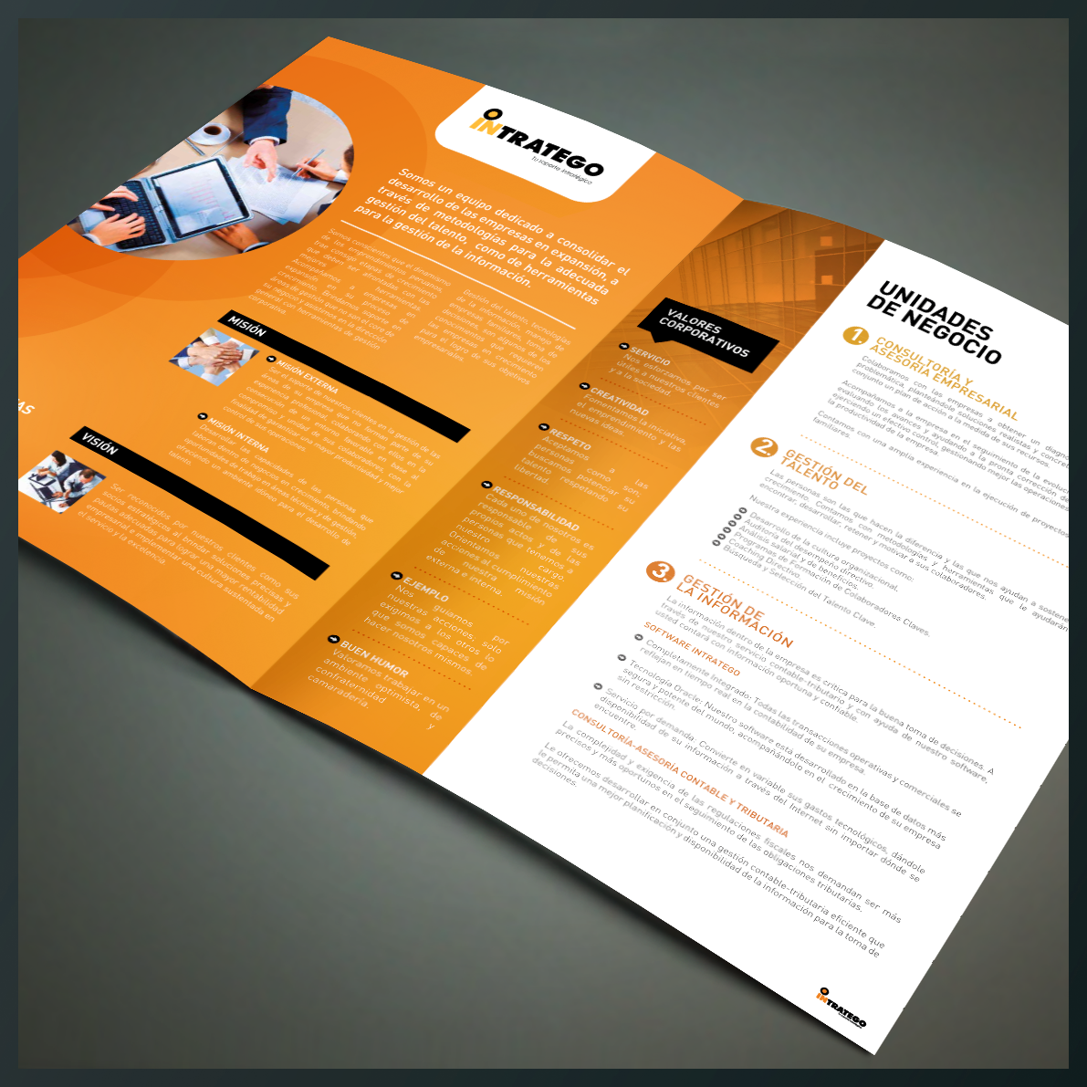
a business consultancy based on the analysis of the company and the implementation of the development in business management. Intratego is a company of professionals in talent management, offering solutions specific to the problems of developing organizations.
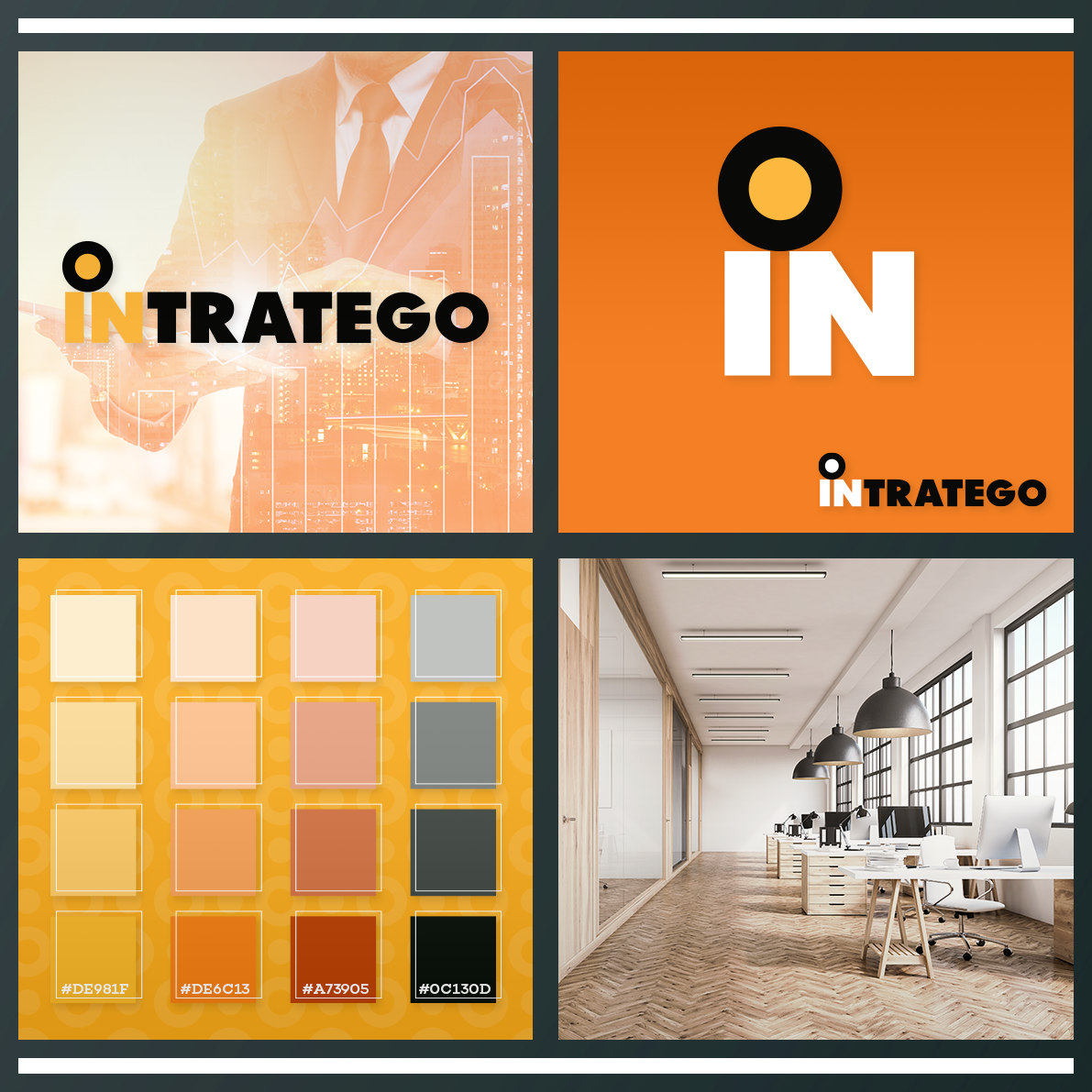
the primordial geometric structure of the logotype is the rectangle, symbolizing stability, reality, and solidity; presenting readability: creating a clear, more assertive and timeless image. the range of colors used are two main ones: the vivid orange color and the black color.
the values and main characteristics of the Intratego brand are represented in its visual identity corporate: responsibility, creativity and originality. these graphic formats will drive its communication and improve the concept of the brand in the market.

