WHAT IS THE GESTALT THEORY?
We know that the mind is very complex, but do you know how visual perception works in the human being? as visual creators we need to understand how they can interpret the viewers our compositions and how our mind acts when receiving that information, and for this we are going to dive into the Gestalt Theory.
there are seven individual principles commonly associated with Gestalt Theory: similarity, continuation, closure, proximity, figure/ground, symmetry/order (also called prägnanz) and common address.

Law of Similarity:
if a design is made up of similar elements, the viewer will receive the whole as a pattern, balanced and coherent. this similarity can be of: shape, color, texture or size. if we want to highlight a design element, we must break this pattern within the set. this effect is called an anomaly.

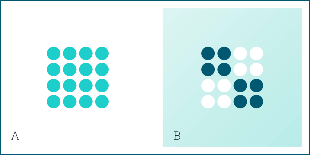
(A). the circles are not linked to each other but we perceive them as a set because they share the shape.
(B). in the following image we break the pattern within the set by highlighting some of the elements with a different color. as we have already said, this is called an anomaly.
Law of Continuity:
the eye will always follow the most coherent and simple visual path. is attracted by continuity in a line or a curve. this principle can be used to draw visual attention to an element of the design that we want to highlight.

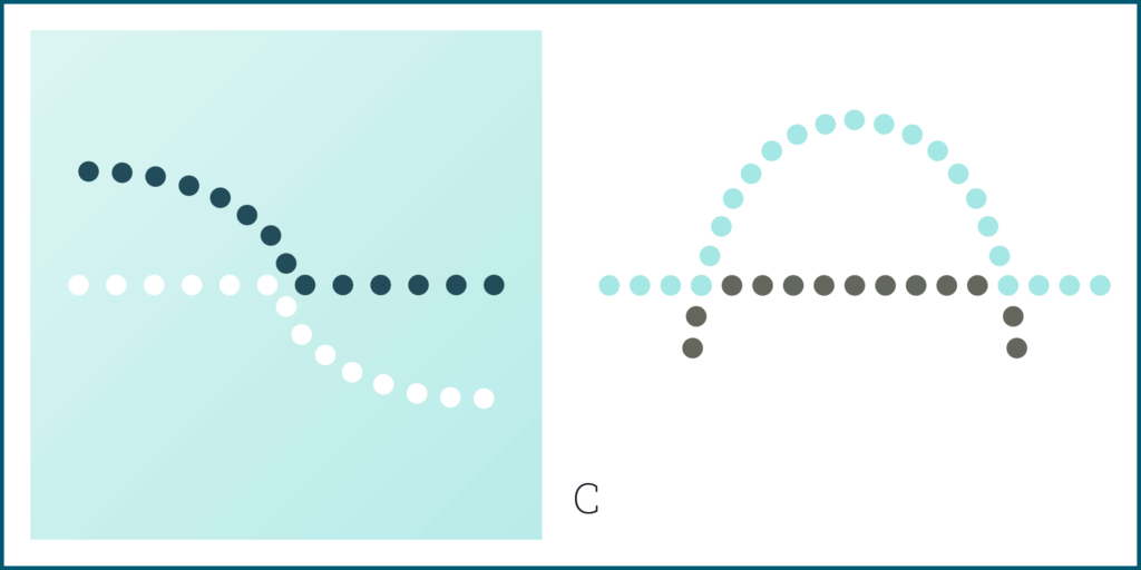
(C). the eye tends to want to follow the straight line from one end of this figure to the other, and the line curve from top to bottom, even when the lines change color halfway through.
Law of Closure:
when we perceive a figure that is not closed, our brain will work to complete the information that is missing to transmit a complete form. this happens because we look for the stability and according to the Gestalt Theory, closed forms are more stable.

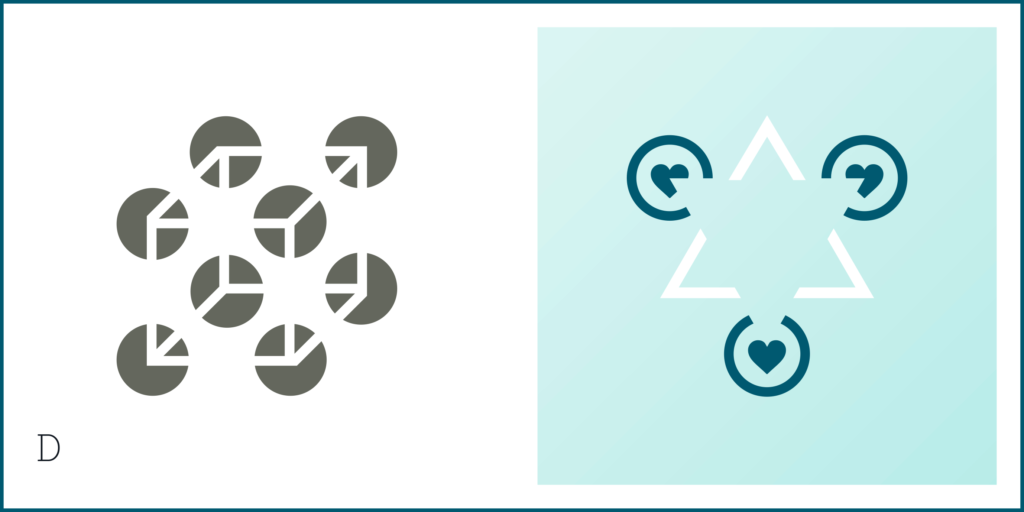
(D). the Gestalt closure principle is illustrated in these examples where the brain completes the forms white, although they are not well defined.
Law of Proximity:
this principle describes how we tend to group shapes that are close together. perceiving them as a whole even though they are separate elements. for this they must share any of these characteristics: shape, color, size or texture.

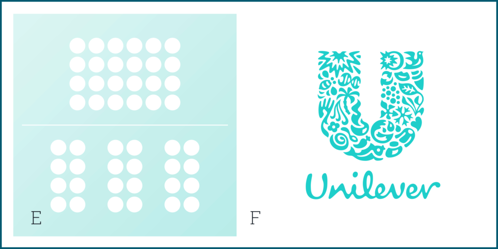
(E). the only thing that differentiates the group below from the group above is the proximity of the lines, however, the brain interprets the lower image as three different groups.
(F). in the Unilever logo, we can clearly see a set of twenty-five elements independent; likewise together with each other, it can be seen that they perfectly form the letter U.
Figure-Ground:
describes the tendency of the human eye to see an object separate from its surroundings. this principle it works because our brain is not capable of treating the same object as shape and background at the same time. same time. the brain wants to see the object in the foreground and the background as two elements independent.

(G). in the logo of The Pittsburgh Zoo, we can see two different images but we cannot see them at the same time. sometimes you will immediately appreciate the tree and the birds, while sometimes you will appreciate the gorilla and the lion, looking at each other.
Law of Symmetry:
objects that have symmetry and order are perceived as part of the same group. a cluttered and unbalanced layout will waste the viewer’s time trying to analyze it, instead of focusing on the message that the composition wants to convey. our mind tends to organize the elements in orderly and stable figures.

(H) the brain will interpret the image on the left as a rectangle, circle and triangle, even when the outlines of each are incomplete because they are simpler shapes than the overall image.
Law of Common Fate:
the basis of this principle is simple, since it establishes that we see those elements visuals that move in the same direction as part of a single group.

(I). in this image, the components appear to form the same assembly, despite the fact that they are independent elements. this occurs because they appear to move in the same direction.
what is interesting from the design point of view is that these laws can be transported from the world of psychology to the visual universe. not surprisingly, in all studies related with the graphic universe it is studied as a basis to understand how we humans capture the visual messages we receive. thus, the shapes we use in our graphic compositions and the relationship between them generate in the mind of who visualizes, new realities that can directly influence in his psychology; and that’s how graphic design can suddenly enter our lives and change EVERYTHING.